Completed : 2018
About:
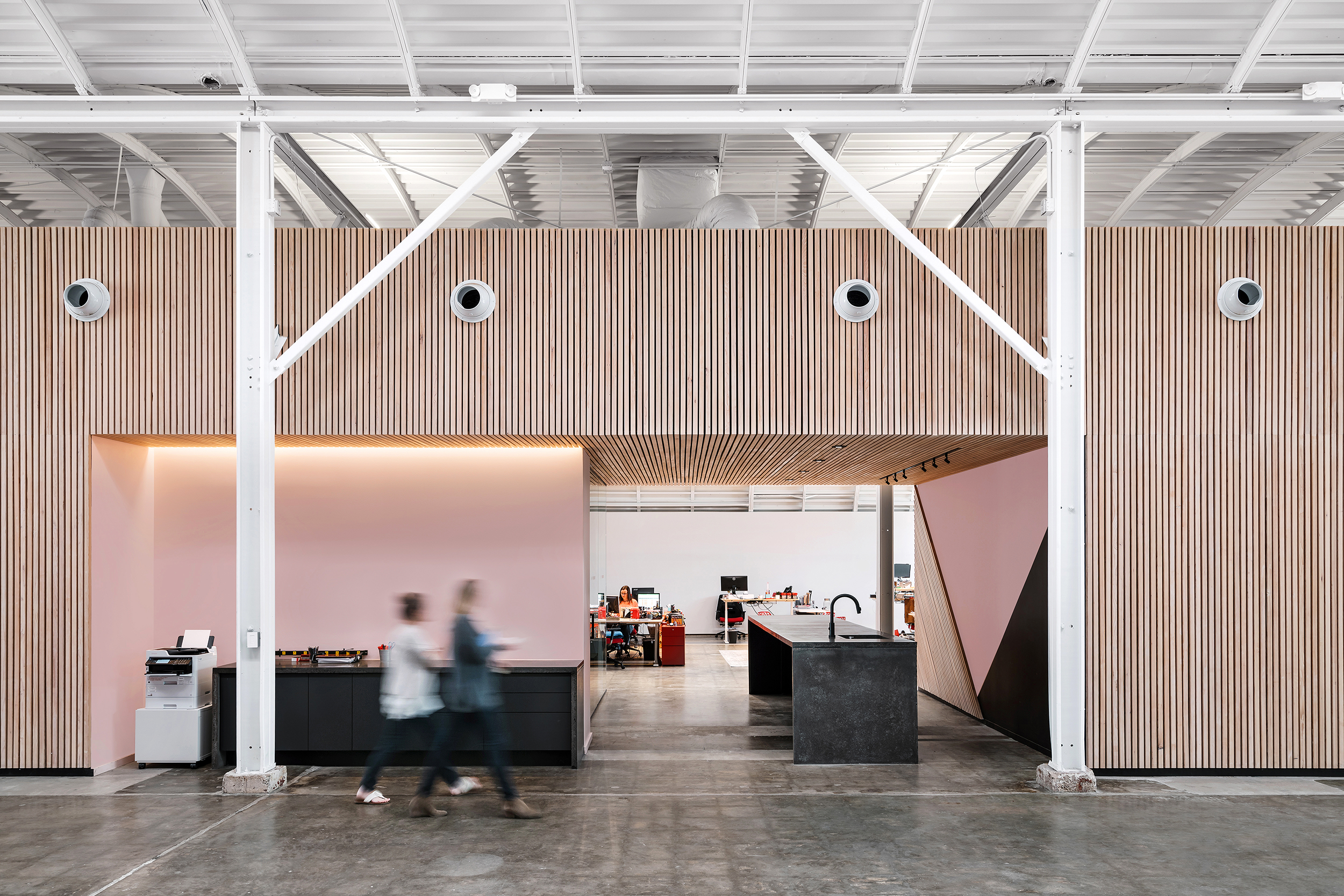
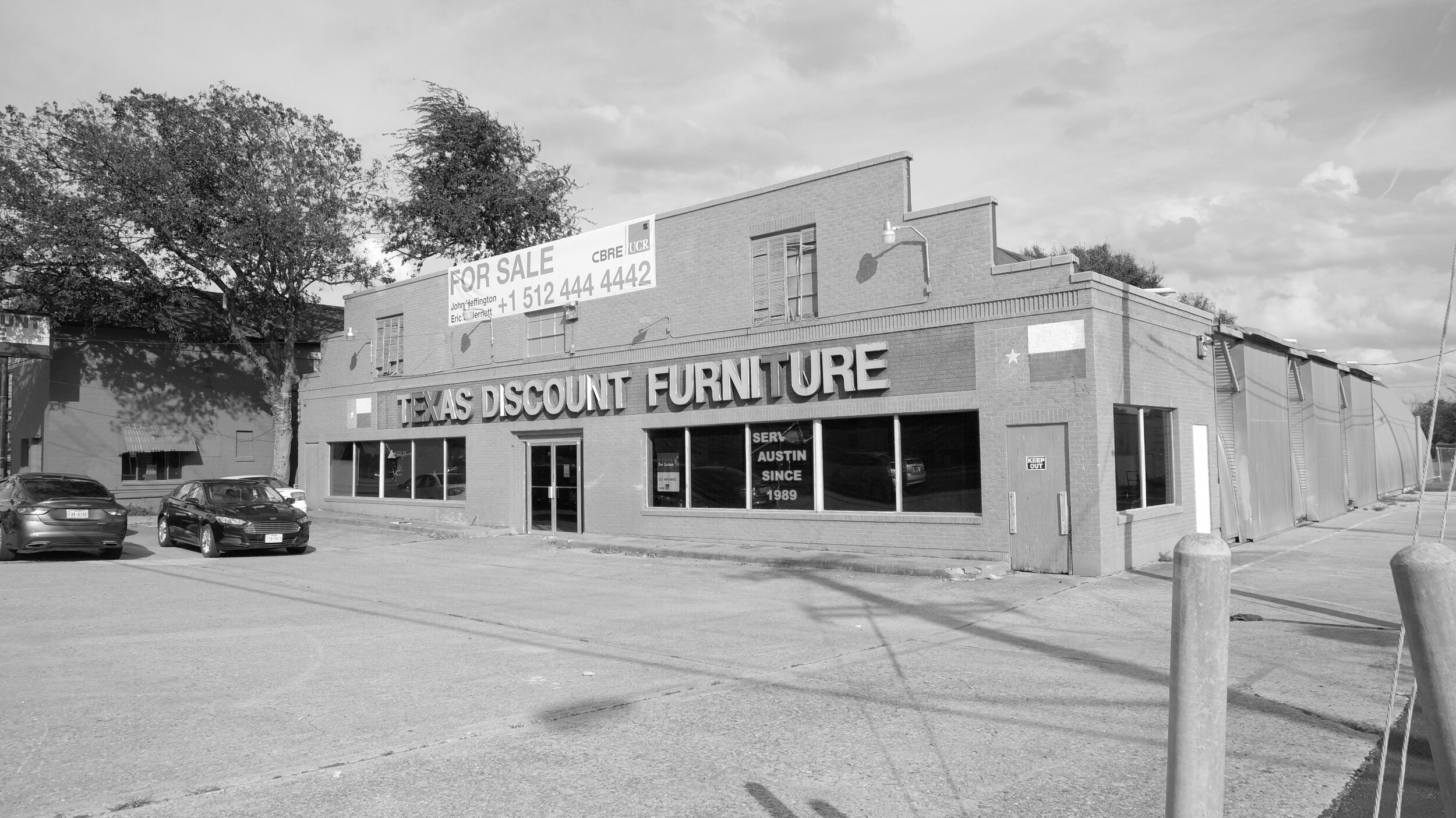
Red Velvet Events Headquarters is a project about structural preservation and re-invention of an abandoned three-bay quonset hut into 21st century office space. Built during World War II as an airfield maintenance shed, the curved structure had sat abandoned for years and had become home to feral animals. Over time, the structure had been patched and covered inside-and-out with a suspended ceiling and layers haphazard repairs.
Our primary move was to remove the layers of time and expose the unique curved structure to the street. The architecture of the exterior opens itself to the street through a new 24 foot high curved glass curtainwall, allowing for daylight to most desks and drama. The curved sides of the building are roofs, rebuilt with modern insulation, roofing and skylights for daylighting. To support the roof behind the curtainwall, a curved steel lateral frame was added, ingeniously designed by Tak Chu of LEAP structures.
The secondary move was one of adding new interior elements independent of the curved structure. Only one new interior wall and duct extends to the roof. Careful consideration was given to integrating HVAC and other building systems within the center bay of the building. Ductwork, plumbing and loud spaces were intentionally centralized to control sound and minimize the visual impact of building systems. Other walls are free-standing partitions that help punctuate the open office and conceal storage spaces for the many Event and Party props the company uses.
To make the office adaptable, all electrical and data wiring was located into special built floor chases, that are fully accessible. This allowed our client and future users to modify furniture and uses for future needs.
Integrating the client’s brand into the environment, we chose to celebrate the playful character of their culture. The client’s branding message “Outplan. Outplay . Outparty!” is showcased on façade to act like a billboard, illuminated nightly to sell their brand message to the thousands of drivers daily. Swings greet visitors in the reception area and dominos are used instead of tile in the restrooms.
Roles: Architect, Interiors, Lighting Design, Furniture Design and Permitting
Team:
Structural Engineer: Tak Chu @ Leap! Structures
MEP Engineer: Jordan & Skala
Jackalope + Signage Fabricator: Ion Art
Consultants: Litmus Industries, Brandon Doreck, Sophia Razzaque
Press:
Texas Architect Article - “Serious Play” 11/2019
Texas Architects Magazine - Award 9/2020
Awards:
2020 Texas Society of Architects Design Award
AIA Austin - 2020 Design Award of Excellence
Completed: Feb 17, 2020
Location: 512 W. 29th Street | Austin . Texas
Services: Architecture, Interiors, Lighting, Signage
Restaurant Type: Fast Casual Vietnamese
About:
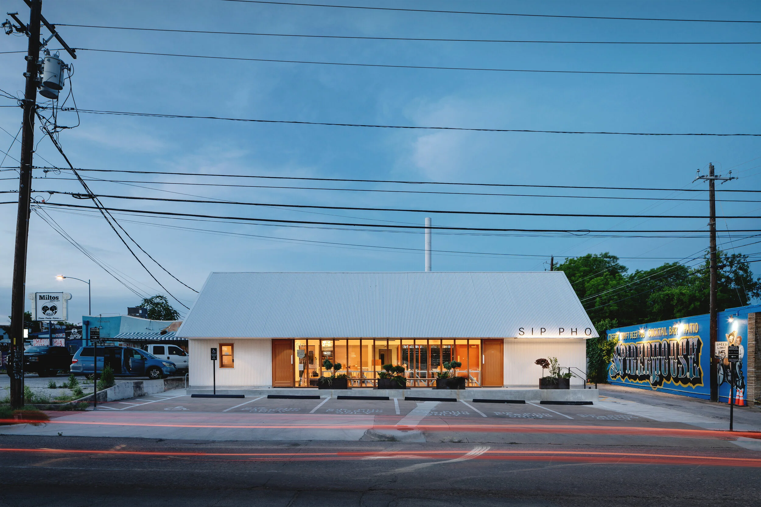
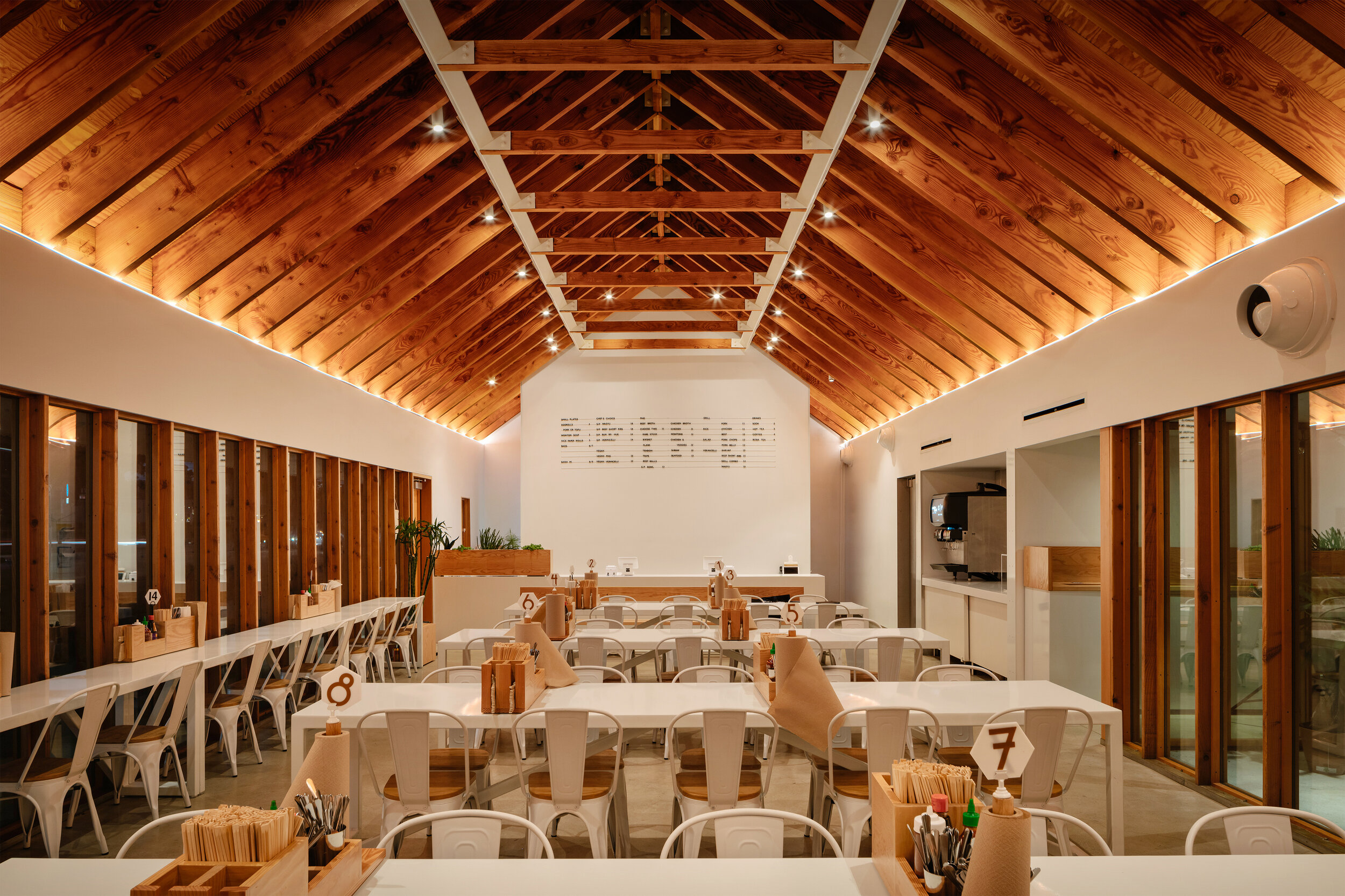
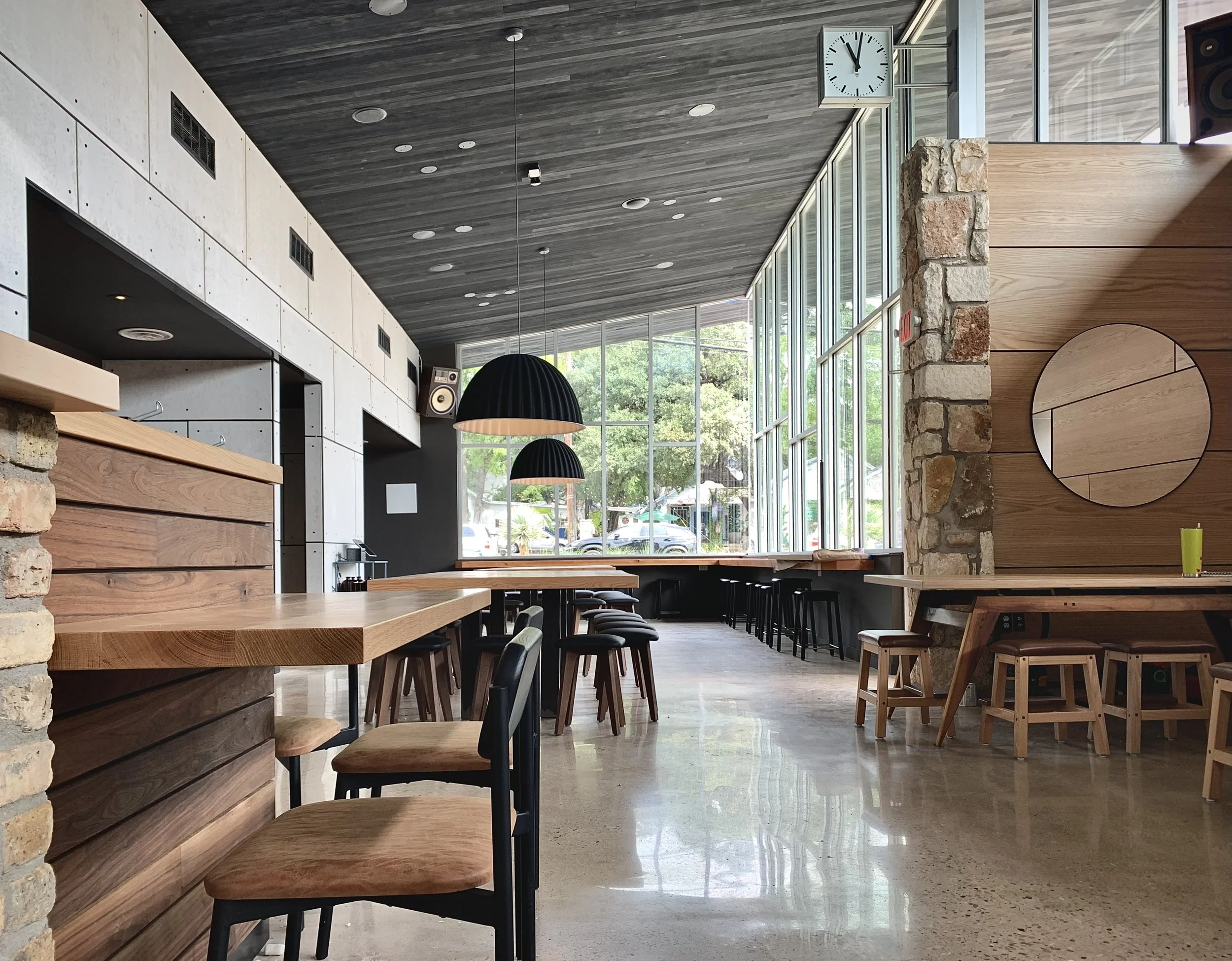
Guided by the owner’s interest in clean spaces, limited budget and restriction to only use the color white, the architecture was an exploration of how to make an ordinary building look extraordinary.
Located north of the University of Texas, the project had to re-utilize an existing footprint for Permitting approval. As a nod to the previously loved BBQ concept that occupied this property, we looked back to earlier times and the creation of Texas.
Learning from our predecessors and Clovis Haimsath’s book “Texas Pioneer Buildings” , we adapted the 1800’s ‘Cut-Out Porch’ typology for 21st century owners. Deep overhangs cover code-required windows blocking direct sun and keeping rain off customers.
In an act of distinction to its context, we opted to offer a different story. Surrounded in a context full of graffiti, blinking neon lights, billboards and gimmicks, we chose to offer the anti-thesis: calm.
There are 4 windows in the project, the 3 largest were required by the City of Austin to be permitted. The 4th a double-hung “to-go order” pickup window.
Every material used on the project was off-the-shelf, including:
° Prefinished white corrugated 7/8” metal panels
° FSC Douglas Fir exposed studs, rafters, window system + plywood
° Drywall with vinyl L-beads
° Velux unit skylights
° Monopoint track heads + tape lighting
Materials: Douglas Fir Lumber, White Painted Steel & Drywall, Concrete, Corrugated White Metal Panels
Furniture: By owner
Fabricators: Boomtown Design (stainless and custom fab), Chris Reeves (Doors + Windows) , Second Chance Fabrication (Tables + Signs), Goodsnake (painted signage)
Photography: Chase Daniel
Lighting Manufacturers: Contech, Acclaim, Super Modular
Press:
Awards:
Completed: 2022
Location: 73 Rainey | Austin . Texas
Services: Interior Design, Historic Preservation, Architecture
Task:
We were asked to design a craft beer brewery within a Historic House within the Historic Rainey Street District.
Solution:
Restore the Historic House and create a different scaled experience not found in Texas. Forget the metal warehouses and industrial yards that are commonly associated with Breweries. Imagine having fresh beer made by brewers, as if in one’s living room. Small. Intimate. And beyond refreshing.
Team:
Pouring With Heart - Owner
John King Construction - GC
Premier Stainless - Brewery
AYS Engineering - MEP Engineer
MJ Structures - Structural Engineer
Keith Davis Young - Branding
Clint Huff - Construction Manager
Photography - Chase Daniel
Location:
320 Congress Avenue
Austin . Texas
Completed: 2017
Brief:
Tucked within the Historic Koppel Building, in downtown Austin, we were asked to re-imagine the building’s lobby and improve accessibility. The lobby suffered from a two major issues: no visible connection to the 2nd floor and an elevator that was inaccessible to the public.
Taking inspiration from hiking, the new Lobby was envisioned as a switchback trail ascending up a mountain. To connect the entrance to the upstairs office, portions of the 2nd floor were removed to open the space to an existing skylight. Working with Austin’s Historic Preservation Office, three of the original arched storefronts were restored and lowered to provide wheelchair access.
Playing off the Brick Detailing in the facade, the stair is clad in “Combed” Hemlock T&G Siding, creating a warm vertical texture. The walls are capped in a matching Hemlock cap, concealing LED tape lights that wash the wood walls with light.
A thin vertical black door pull suggests a hidden door leads to a elevator beyond.
Materials:
- US Lumber Brokers Comb Siding, Primeline Hemlock
- Rubio Monocoat sealer and Farrow & Ball Paint
- Ann Sacks Penny Rounds
Roles: Architect, Interiors, Lighting Design
Photography: Leonid Furmansky
Press:
Texas Architect Article - “Magic’s Mountain”
design: 2023
completed: 2024
Location: 1510 E. Cesar Chavez, Austin, TX
Photos: Chase Daniel
About:
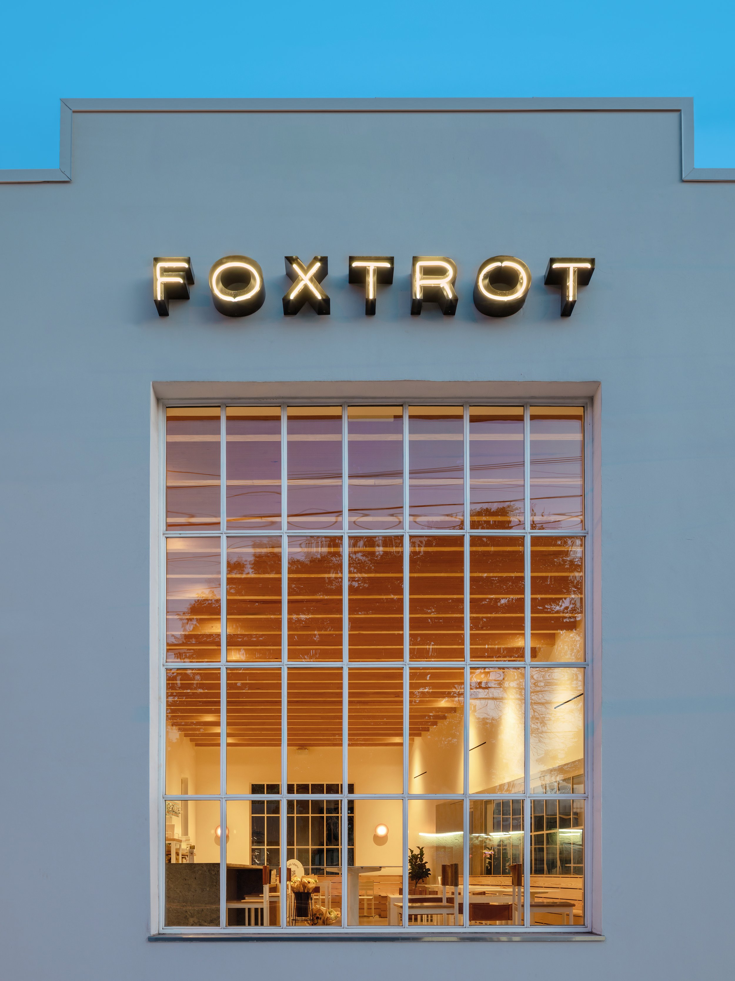
In the fall of 2023 we were asked to re-imagine a gritty bbq / beer tavern, which was designed by North Arrow Studio in 2014 into a light-filled space.
The design manifested over the period of 4 weeks, channeling the 1930’s Italian Futurismo, a distinctive bold mix of cubism and art deco. Working with mostly existing elements, the bar, ceilings, finishes and lighting were softened with plaster curves, pink troweled stucco and a basil green color.
It was our first project in Austin to be built on-time and on budget due to a great contractor + ownership team.
c. 2018
Location: West 4th Street | Austin . Texas
Client: FBR Management
Task:
Built in the early 1900’s, this brick warehouse and former brothel has lived many lives. Our task was to modernize the life-safety and accessibility and fit a new cocktail bar into an old basement storage space. The challenge was not simple, or easy, as the existing ceiling height was 7’-10”.
Idea:
The concept was to make a destination bar, turning an undesired space into an intimate, dark and properly illuminated space.
Photos by: Leonid Furmansky
c. 2019
Role: Architect of Record
Client: Heaven & Hill / Deep Eddy Vodka
Interior Design: McGuire Mooreman Hospitality
General Contractor: Knight Construction
Photos: Coming soon…
c: 2019
Location: Industrial Terrace | Austin . Texas
Client + General Contractor: Marc Knight
Task:
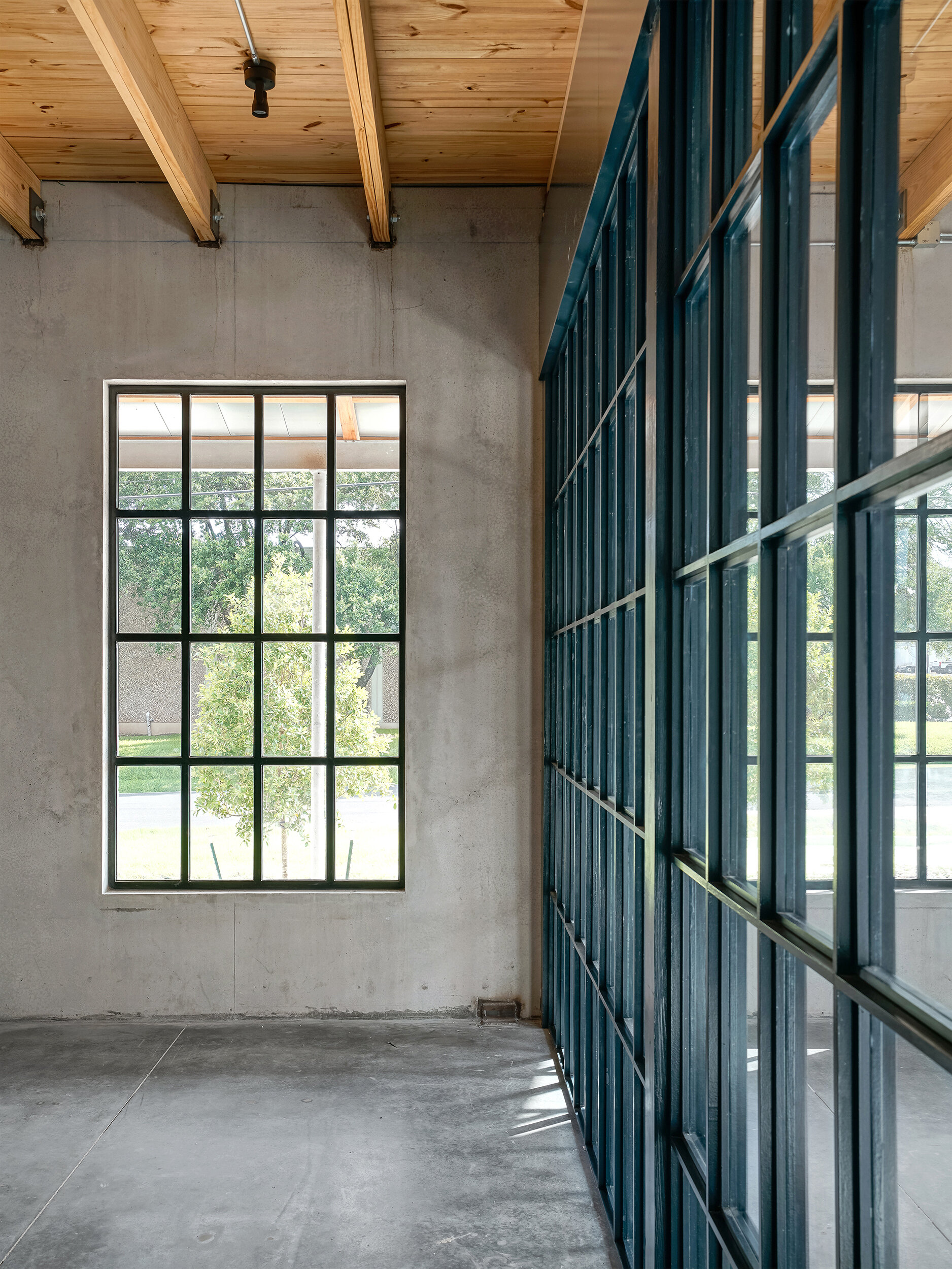
The owner, Marc Knight, was in the process of pouring the concrete walls for this 2-story building in North Austin, when the project started. There had been several voices involved on the exterior design of the building when I came to this project. I took a step back and saw the rawness of what was being built and how different it was compared to most new steel-framed buildings in Austin. My reaction was to keep the spaces raw and as unfinished as possible.
Initially we designed a common area for all future tenants to use, which had a library, coffee nook and Slayer Espresso Machine. It was a space to have an intimate conversation and truly take a break. Next came the stair and guardrail designs, which were exceptionally built by Roy Greider.
In time, potential tenants started responding to vision and the entire building was quickly leased.
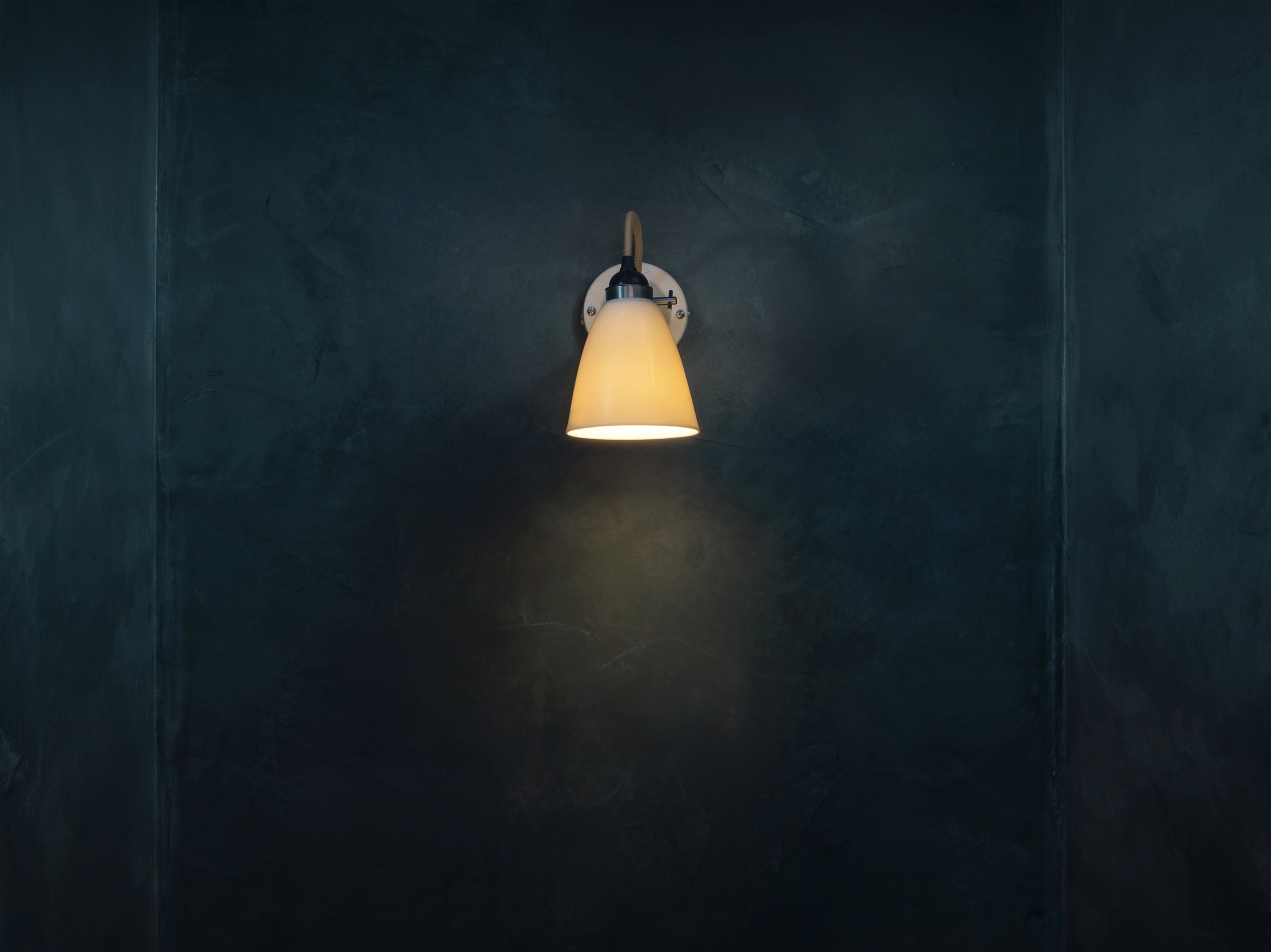
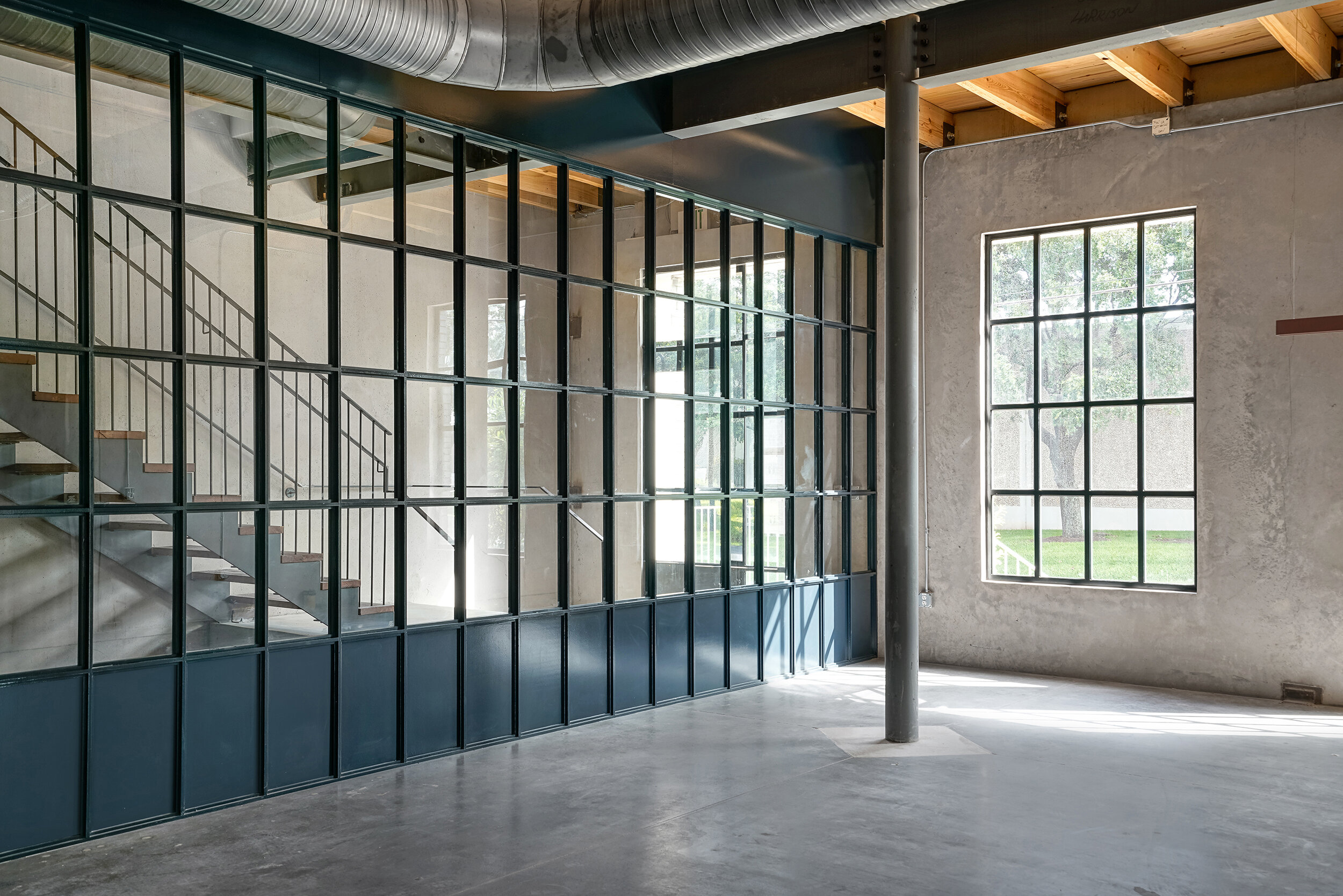
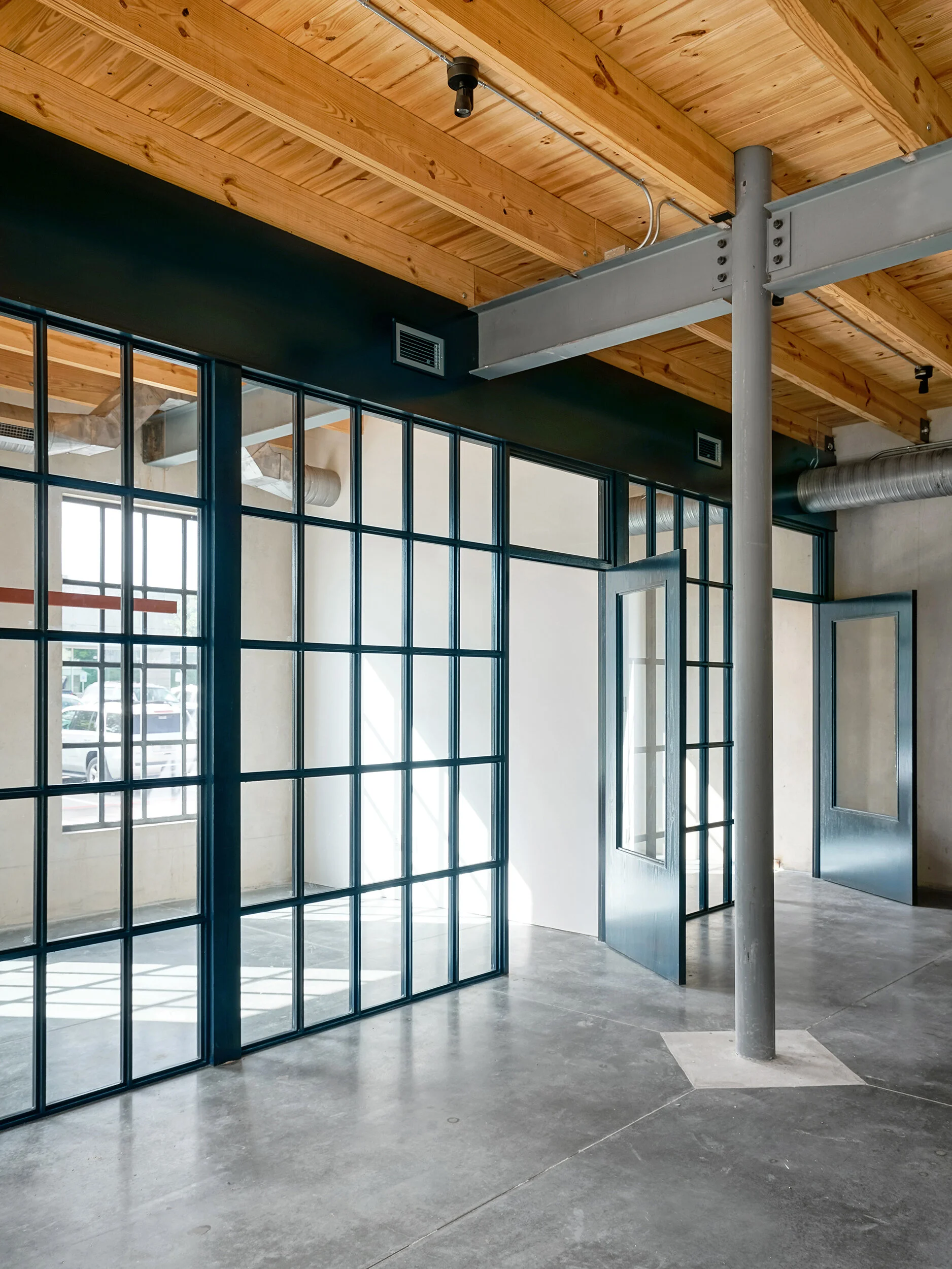
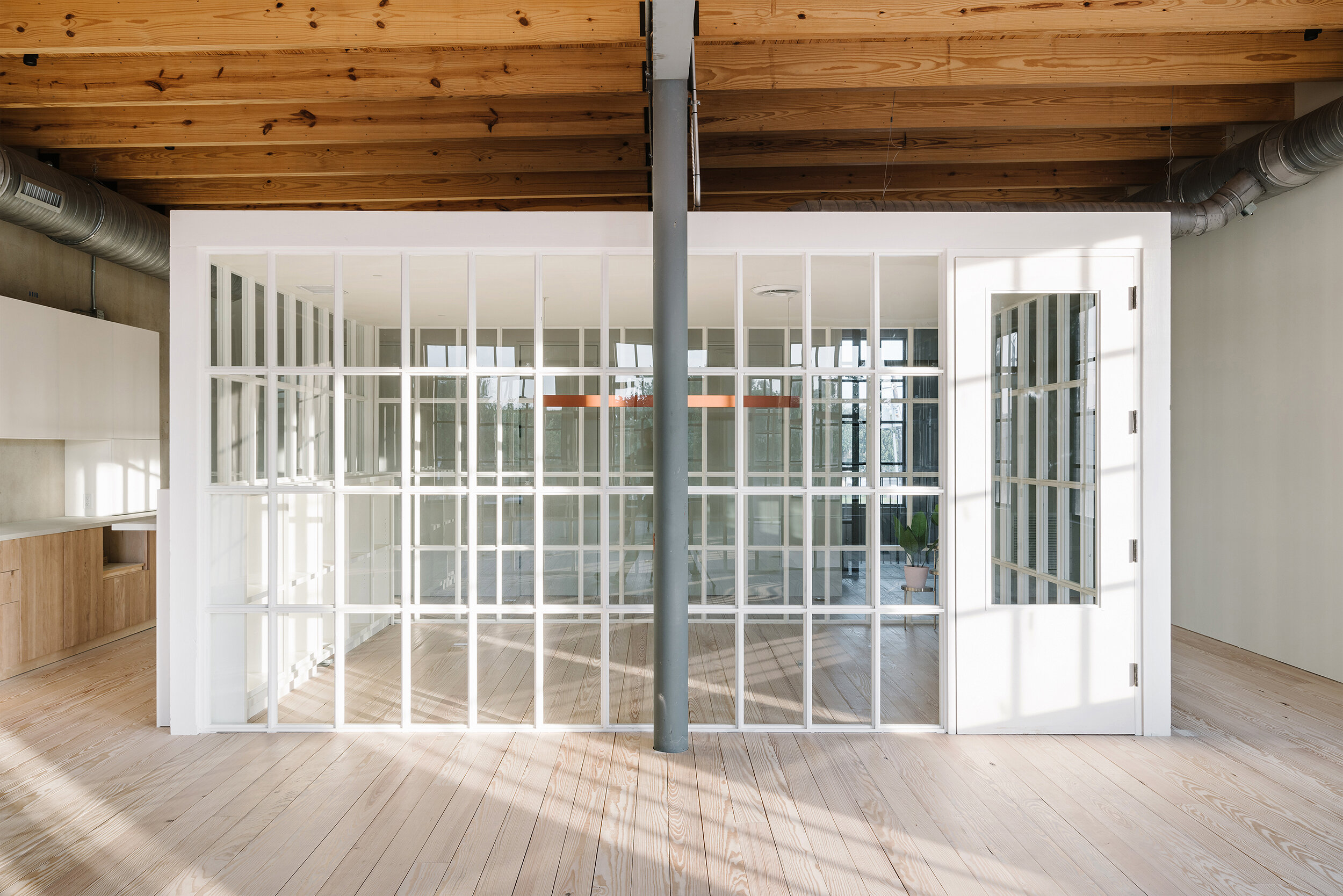
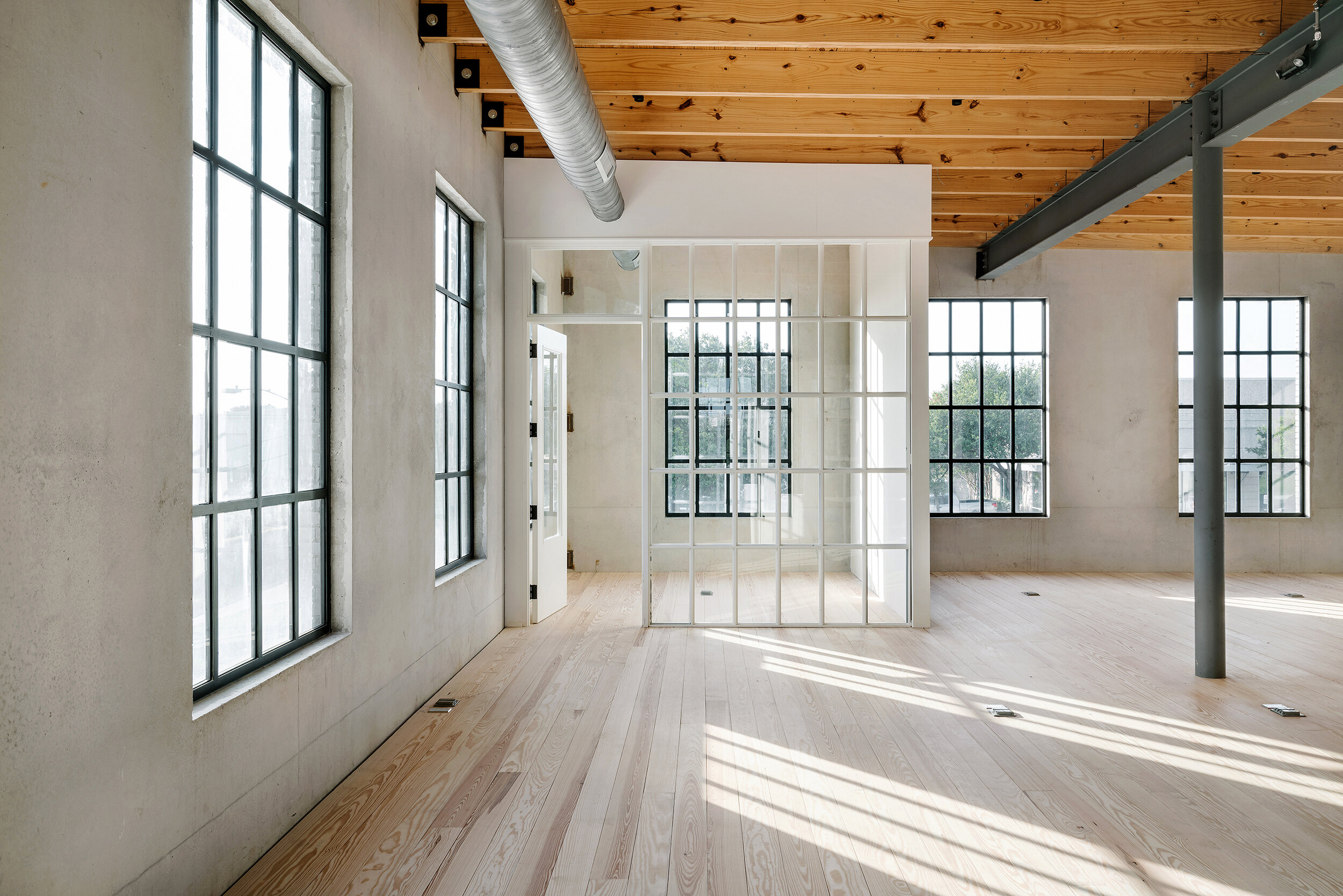
Marc graciously invited me to design all of the interiors. In an effort to avoid drywall, dropped ceilings and expected finishes, the strategy was to leave everything exposed and carefully design the lighting, wiring, ductwork and partitions to enhance the “loft” quality of the spaces.
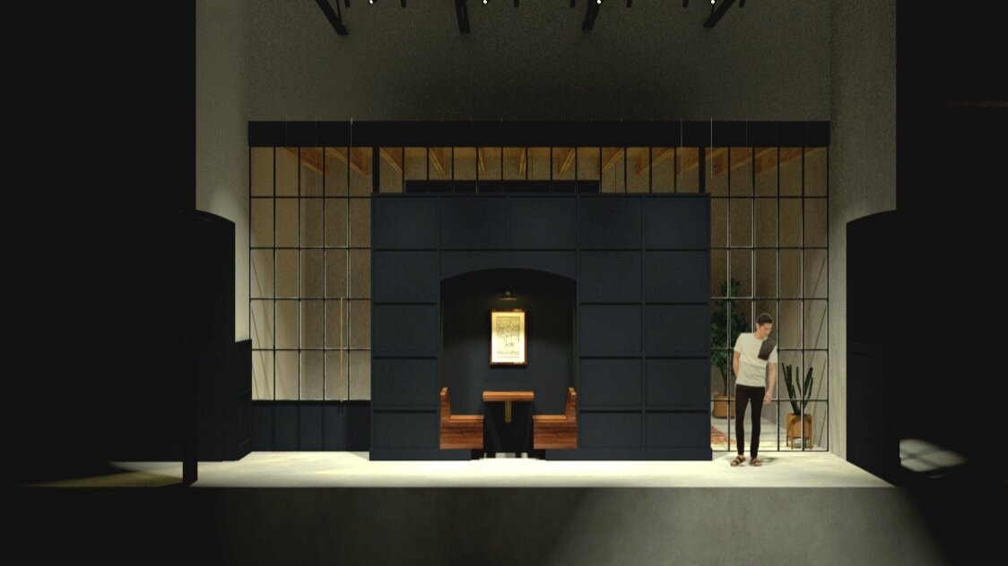
The carpenter Chris Reeves, built 8 wood framed window walls, that could pass for steel windows, unless one looked closely. The glass partitions echo the exterior windows in proportion, but were painted and detailed differently to match each space’s program.
Services: Interiors + Lighting
Completed: 2021
Location: 1128 W. 6th Street | Austin . TX
Roles: Architecture, Historic Preservation, Interior Design and Lighting
Task:
Restore and preserve a 1918 building in the Clarksville neighborhood as part of a larger retail district masterplan for the Lambert McGuire Team.
Completed: 2023
Location: Star Bar, Austin . TX
Scope: Architecture
About:
Strong but mighty.
Designed for the owners of Star Bar + Via 313 Pizza, this small commercial kitchen addition to a well loved Cocktail Bar replaced a former food truck.
The kitchen box is made of structural concrete block walls, with one highly textured that references the process of cheese melting when cooking pizza. The large Triangular walk up window allows customers and food delivery drivers to quick pickups and a subliminal pizza slice reference.
Photography: Chase Daniel
Phase: Construction
Location: Fredericksburg . Texas
Size: 5,000 SF
Task: Design a resort Club House in the Texas Hill County
About:
Imagined as settler’s wall in the landscape, that wind or time had knocked over…this Club House is the reception building for a resort north of downtown Fredericksburg.
The building is a simple T-shaped plan, flanked by two outdoor rooms centered to view a grove of Texas Red Bud trees.
c: 2019
Statement:
Renovate an existing 1-story pre-engineered steel warehouse into an indoor entertainment space for Bocce, Axe Throwing and Ping Pong.
This project is conceived as a mash-up of a western store meeting a 1960’s Googie bowling alley. The facade recalls comforts, knotty cedar board and batten siding contrasted with a zig-zag awning over the City required glass entrance.
Services: Architecture
Contractor: Owner built
Photography: Leonid Furmansky